Introduction
I’ve been shocked lately by mortality statistics. My grim inspiration being a combination of: talking to my sister about gun violence statistics, reading a book on financial planning and helping a good friend out with a legal retirement issue (I ran simulations of his death 100 millions of times, fun!). The most shocking thing what age are 50% of people dead by (both men and women). This is best seen in this social security – actuarial life table:
Social Security – Acturial Life Tables
On average:
- 50% of men survive past age 80.
- 50% of women survive past age 84.
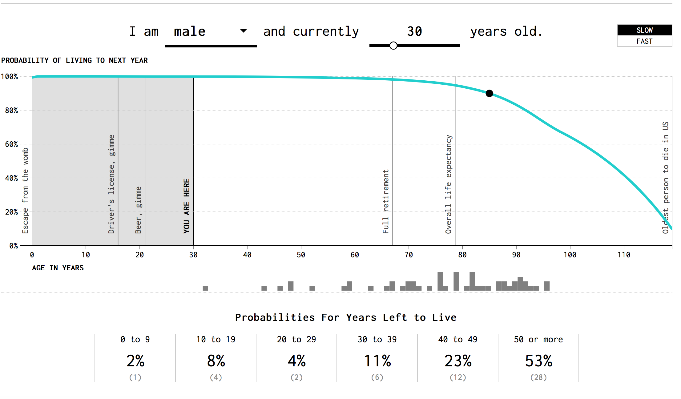
Don’t want to look at raw data (I don’t blame you). Here is an awesome data visualization that I take no credit for at all:
Note that like the actuarial tables, the odds of dying rapidly increase with age!
Every Single Death?
Did you realize the CDC has all 2.6 million or so deaths (per year) recorded in a database? The data is anonymized! Just in case you were worried!
- CDC Wonder (US deaths): https://wonder.cdc.gov/cmf-ICD10.html
- Kaggle (CDC Wonder Extract): https://www.kaggle.com/cdc/mortality/data
I ended up running death statistics by age in a IPython notebook with my currently limited (but improving) understanding of Pandas. Interestingly enough, I got approximately the same numbers (tallying all death counts). If you want to do you own analysis, use Kaggle data set.
As someone in their early 30s, I had no sense of aging at all. Instead, I’m constantly thinking about beautiful places to go on vacation or what to explore in the city (Boston). Let’s add vacation and Boston photos to cheer the article up:

Bahamas – Somewhere Beautiful

Top of the Hub!
Anyway, back to the statistics aspect! What’s another cool factoid we could discuss!
Gun Suicides (note not homicides)
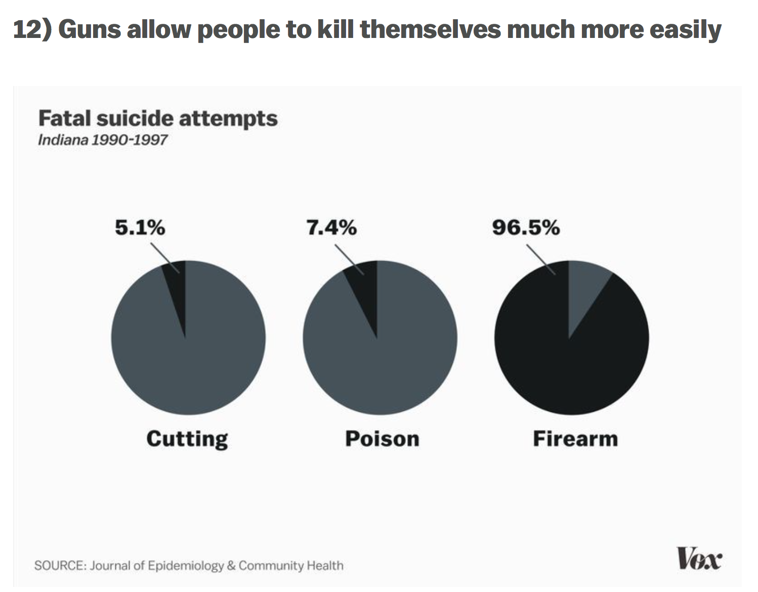
I understand that the buzz in media is to implement gun control to prevent violent homicides. Did you know that around twice as many people die in gun-related suicide events? I wasn’t aware of this problem until my sister mentioned it! Two graphs in Vox really spoke to me:
Link: Vox 17 Charts on America’s unique gun violence problem
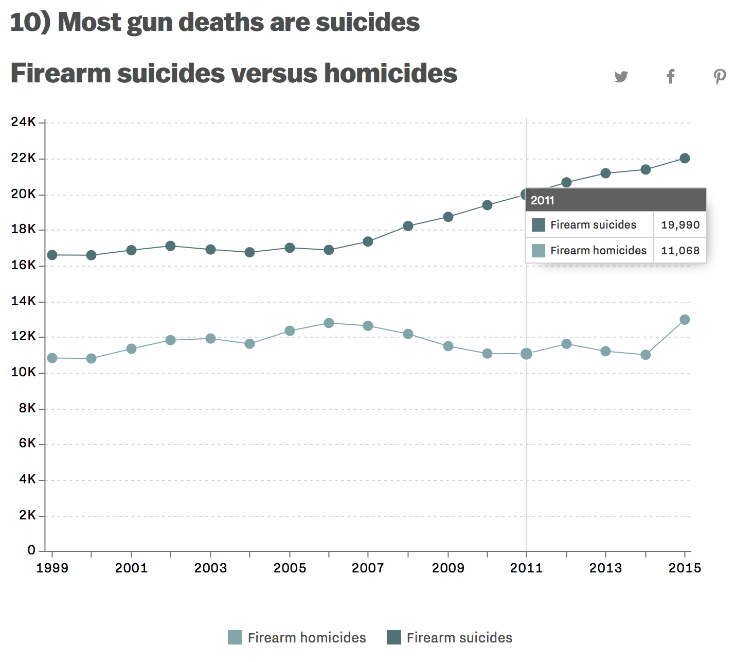
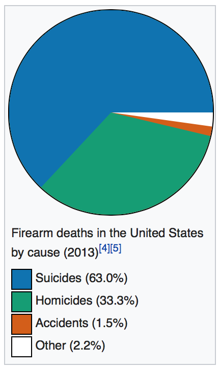
I don’t want to get too deep into gun control (the news covers it well enough), but I do find it interesting that no one in the media talks about what seems to be a huge issue! Something that claims 2 times the number of lives as gun homicide involving the exact same weapons (guns are involved in 50% of suicides)!
Just to provide a second source, here is a wikipedia chart:
Homicides, what actually happens!
If you read a little more on the wikipedia article, you can find some interesting information. For example, only 1% of gun homicide involves mass shootings (often shown on televisions) quote from wikipedia:
Deadly mass shootings have resulted in considerable coverage by the media. These shootings have represented 1% of all deaths using gun between 1980 and 2008.[116] Although mass shootings have been covered extensively in the media, mass shootings account for a small fraction of gun-related deaths[17] and the frequency of these events had steadily declined between 1994 and 2007. Between 2007 and 2013, the rate of active shooter incidents per year in the US has increased.
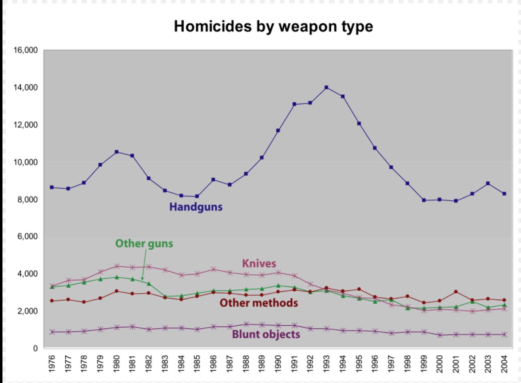
When I think about mass shootings, it usually involves a child who got an AR-15 and decided to vent his anger on the student body. What does the typical homicide look like? It happens that 75% of these homicides are caused by handguns. Shotguns and assault rifles only account for about 9% of gun-based homicides:
According to the FBI, in 2014, there were 8,124 total firearm-related homicides in the US, with 5,562 of those attributed to handguns.[8] The Centers for Disease Control reports that there were 11,078 firearm-related homicides in the U.S. in 2010.[10] The FBI breaks down the gun-related homicides in 2010 by weapon: 6,009 involved a handgun, 358 involved a rifle, and 1,939 involved an unspecified type of firearm.[11] In 2005, 75% of the 10,100 homicides committed using firearms in the U.S. were committed using handguns, compared to 4% with rifles, 5% with shotguns, and the rest with unspecified firearms.[75]
I am not in any way making an opinion about outlawing assault rifles. Instead, I’m looking at the data and coming to the conclusion that handgun related deaths are much more common (draw any conclusion from that):
Homicides, the perpetrators!
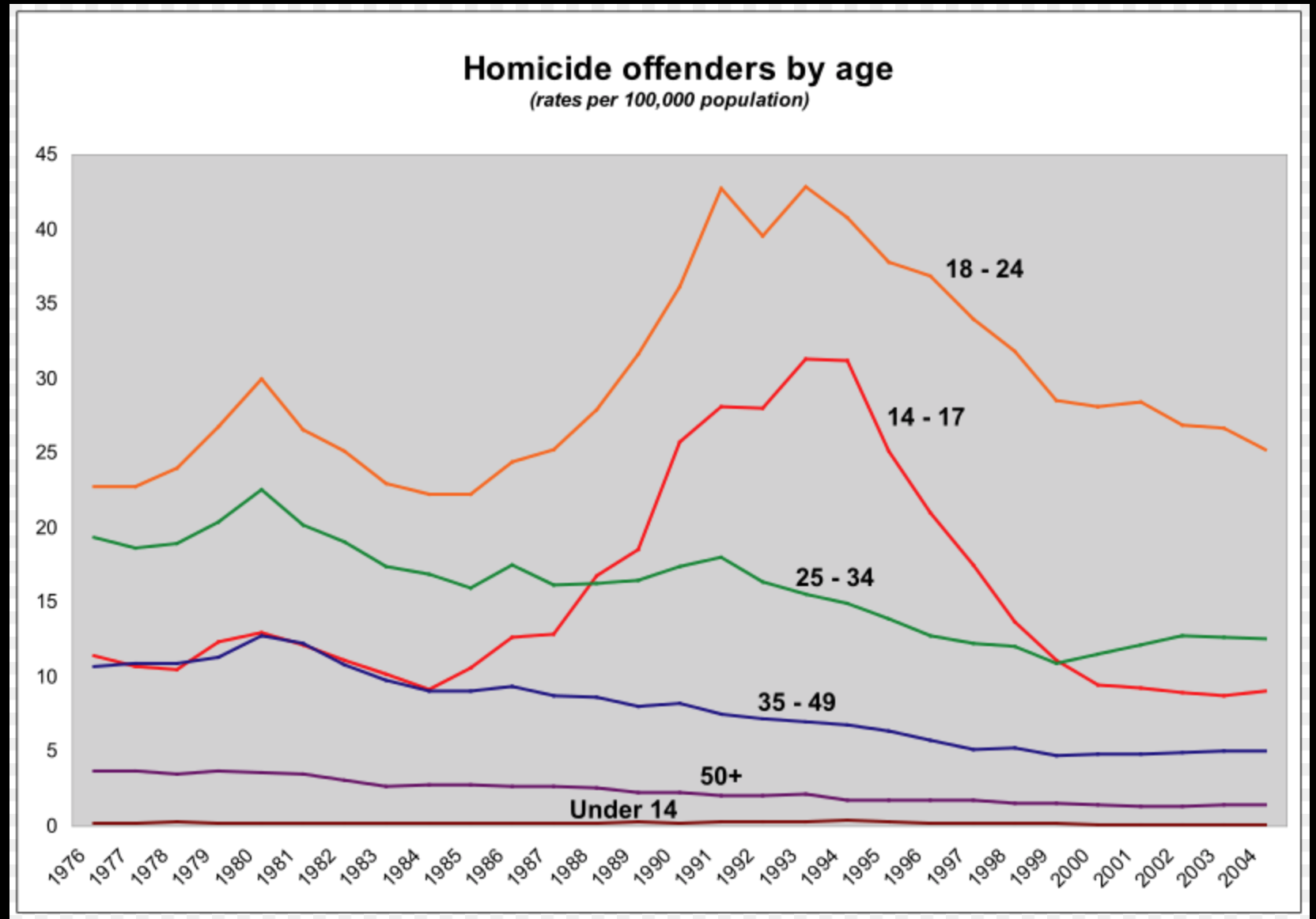
Another interesting chart on wikipedia is the homicide by offenders age. The clear outlier here is the age group: 18-24 with 14-17 year olds being more prominent in the 1990s. 25-34 year old range seem to swap places with 14-17 year olds around 2000 becoming the second most violent group! Alright, we understand the perpetrators, but what about the victims?
Homicides: Victims!
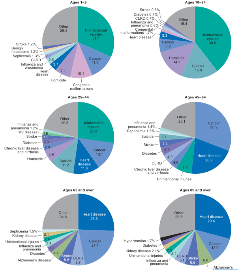
How common is it to die from homicide (all) and let’s bring in suicide as well! This CDC paper had some really great charts in it:
National Vital Statistics Reports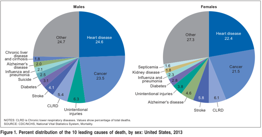
It’s not big enough of a problem to be listed as a top 10 leading cause of death in the US (suicide is a top 10 killer for men: 2.5%). The more interesting part comes when you break it down by age group:
It ends up that suicide and then homicide are responsible for significant percent of deaths between 1-44 and taper off at around age 45 when other diseases become more prevalent.
With such huge percents, you would think that suicide and homicide would be top topics for our society. The above pie charts misinterprets the amount of deaths. The odds of dying young are rare! Only 5% of people die before the age of 45. That’s less than 200,000 of 2.6 million deaths. Overall around 10,000 of 2.6 million deaths are associated with gun homicides: .4% of US deaths (all homicides are around .6% of all US deaths).
Gun-related Deaths: The Devil is in the Details!
Data can tell sad stories. Three of those stories involve: men, old white men and young black men. An article in fivethirtyeight.com provides the data visualization below (click to interact with it yourself):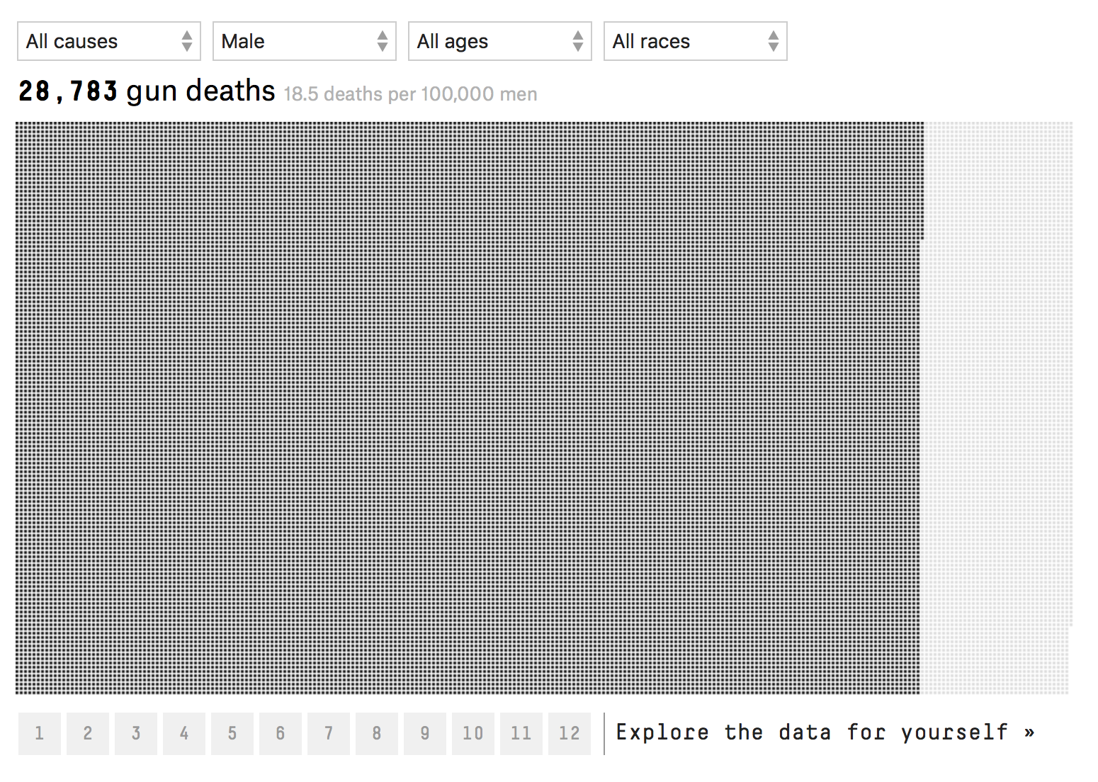
85% of gun-related deaths involve male victims. Men are 6 times more likely to die from guns than women. Within the male only group, two groups of victims stand out: old white men and young black men.
If you take all male deaths in the aggregate, 18.5 men die have a gun-related death per 100,000 men. When you sub-divide this, we find that 11.7 men committed suicide and 6.4 died in homicide per 100,000 men. The rest of the deaths .4 were related to accidents or could not be determined. Comparatively, The aggregate statistic for women is 3.0 gun-related deaths per 100,000 women.
Within the suicide statistics, white males are 3-5 times more likely to commit suicide than any other male only racial group. These odds increase with age. At ages 15-34, the suicide rate is 13.4 per 100,000 white men. That jumps to: 19.7 for white men aged 35-65 and a startling 28.2 for white men over 65 years of age. Black men, the next highest racial group only had 5.3 suicides per 100,000 black men. A factor of 5 less.
Young black between 15-34 males have the highest incidence of homicide: 73.5 homicides per 100,000. That’s a factor of 5 higher than 15-34 year old male group: 14.8 homicides per 100,000 and a factor of 10 higher than all males combined: 6.4 homicides per 100,000 men. Homicides decrease with age. Black men 35-65 having: 21 homicides per 100,000 and those older than 65 years: 3.4 homicides per 100,000.
Sense of Scale:
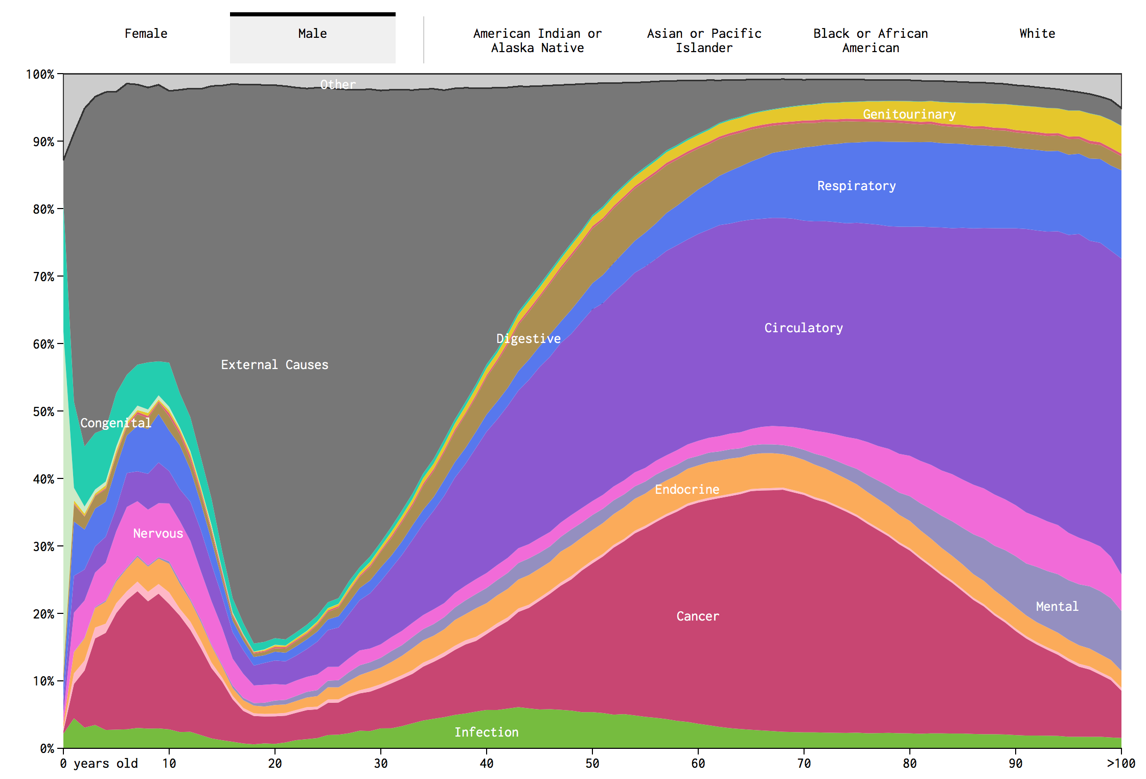
Like most things in life, I often have no sense of scale. I know for example that around 50% of deaths are caused by Cancer and Heart Attacks. I have no clue how that varies by age. The below graphic was really interesting, click to access the interactive variant (provided by flowing data.com):
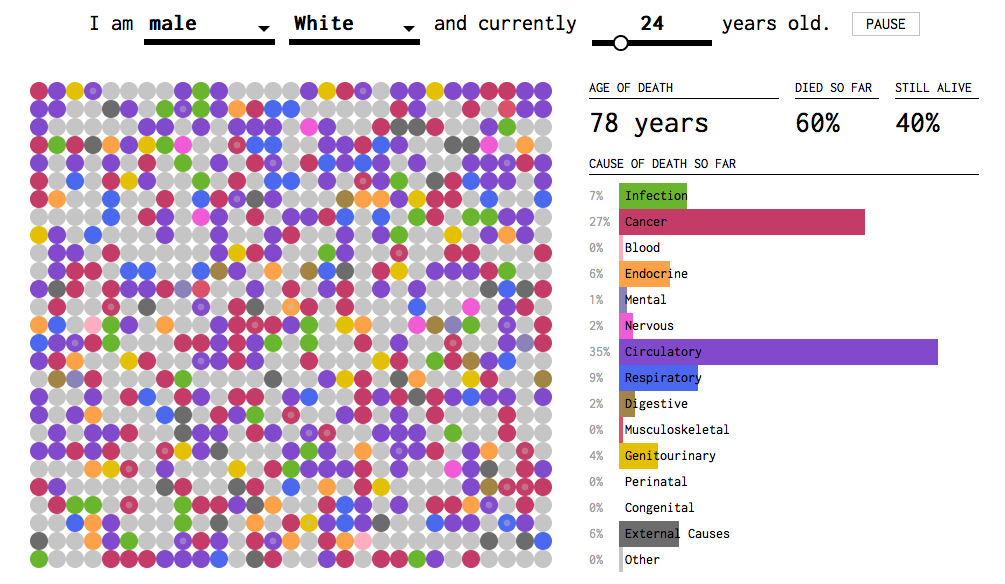
Another cool version of the above data is a simulation done by Flowing Data, click to access the interactive article:
My big conclusion on this is that most deaths are related to age-related/life style disease! That definitely explains the average life expectancy is in the late 70s and 80s.
Summary:
What is the most important conclusion I got out of this? Mass shootings with assault rifles is a very rare incident. That doesn’t make it any less tragic. On the other hand, homicides with handguns are significantly more common. Homicides involve a handgun 75% of the time. The perpetrators and victims are typically under the age of 45 and these deaths represent .4% of all US deaths in a given year.
Only 1 in 20 people die before the age of 45. The great killers are lifestyle and age-related diseases that become more common after the age of 60. The amount of deaths increases drastically over time (actuarial tables). Two diseases: heart attack and cancer account for 50% or around 1.2 to 1.3 million deaths a year. That’s a staggering number compared to both suicides (around 40,000) and gun-related homicides (around 10,000). That is, you are 120 times more likely to die of heart attack or cancer than violent gun homicide.
What are your thoughts on the topic? How do you think scale of the problem should influence public policy? Do you think we should view mortality rates differently based on age brackets? How does the media influence on perception of death? I tried to make this as apolitical as possible so that the data speaks for itself.
Any great data visualizations or research on the topic?
Sources:
Most of the data was derived from the CDC and wikipedia!
Now, for a bit of happiness to improve everyone’s mood (distract from the morbid topic). Here is a kitten hanging out!

