Visually Explained
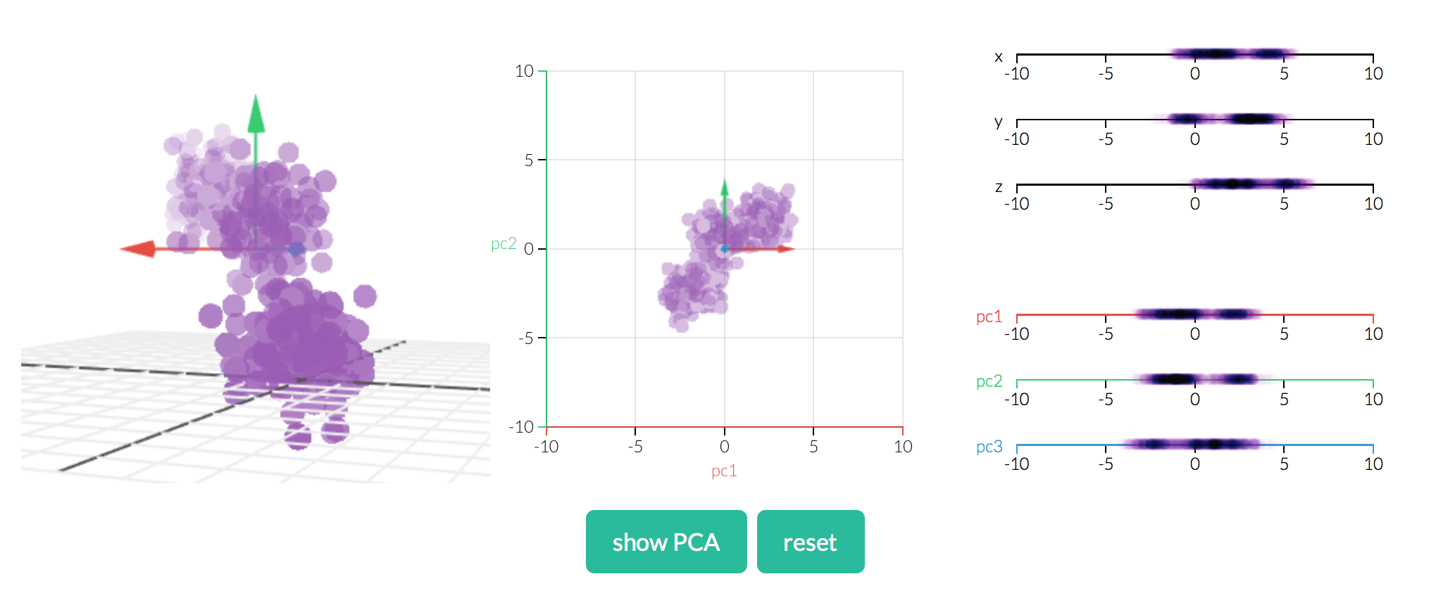
At work, a software engineer provided a link to interactive data visualizations. The visualization shows a statistical model and their fit with data. The data points can be moved/modified instantly influencing the model. It’s a fun way of seeing how a model works.
Interactive Data Visualizations: Statistics Models
 Example Interactive Visualization
The models and concepts available are: PCA, OLS, Conditional probability, Markov Chains, Eigenvectors and Image Kernels.
Chris
Similar Posts:


