Category Archives: Data

Guns, Germs and Cancer

Introduction

I’ve been shocked lately by mortality statistics.  My grim inspiration being a combination of: talking to my sister about gun violence statistics, reading a book on financial planning and helping a good friend out with a legal retirement issue (I ran simulations of his death 100 millions of times, fun!).  The most shocking thing what age are 50% of people dead by (both men and women).  This is best seen in this social security – actuarial life table:

Social Security – Acturial Life Tables

On average:

  1. 50% of men survive past age 80.
  2. 50% of women survive past age 84.

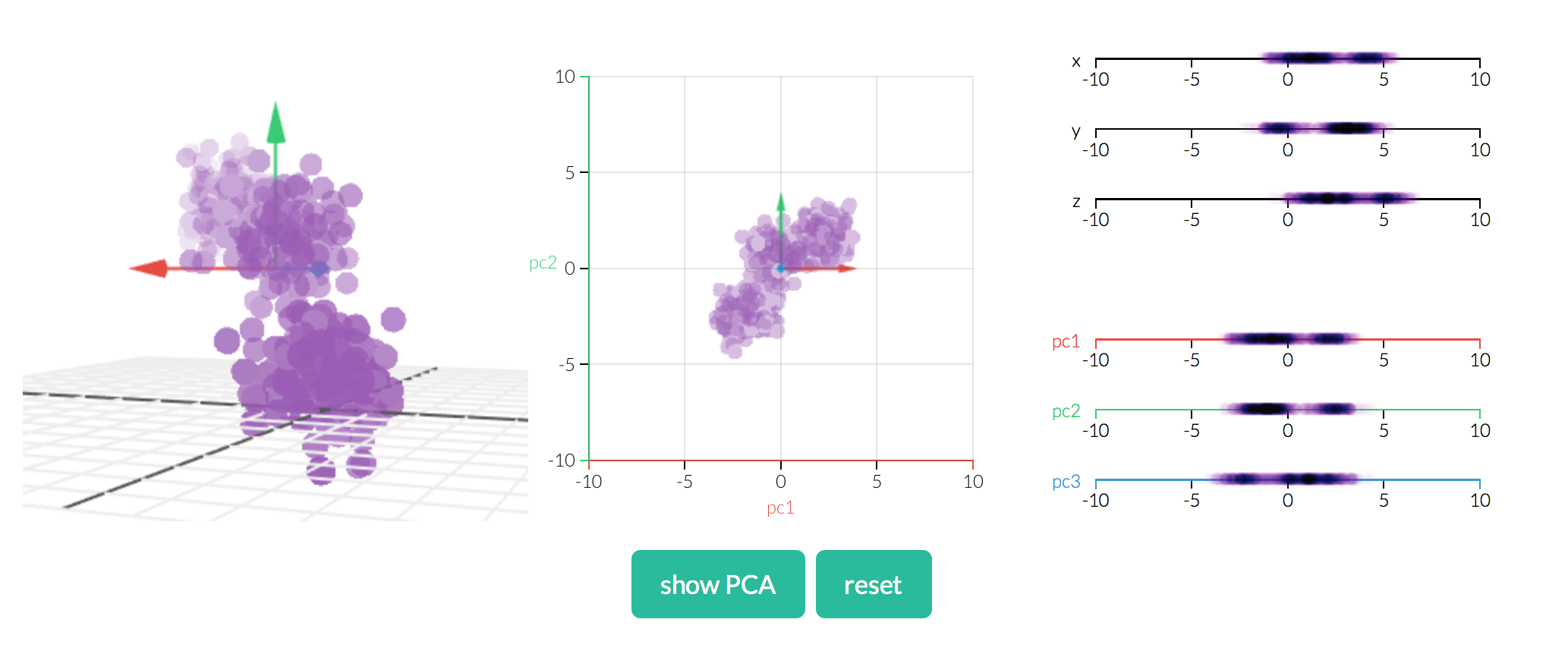
Don’t want to look at raw data (I don’t blame you).  Here is an awesome data visualization that I take no credit for at all:

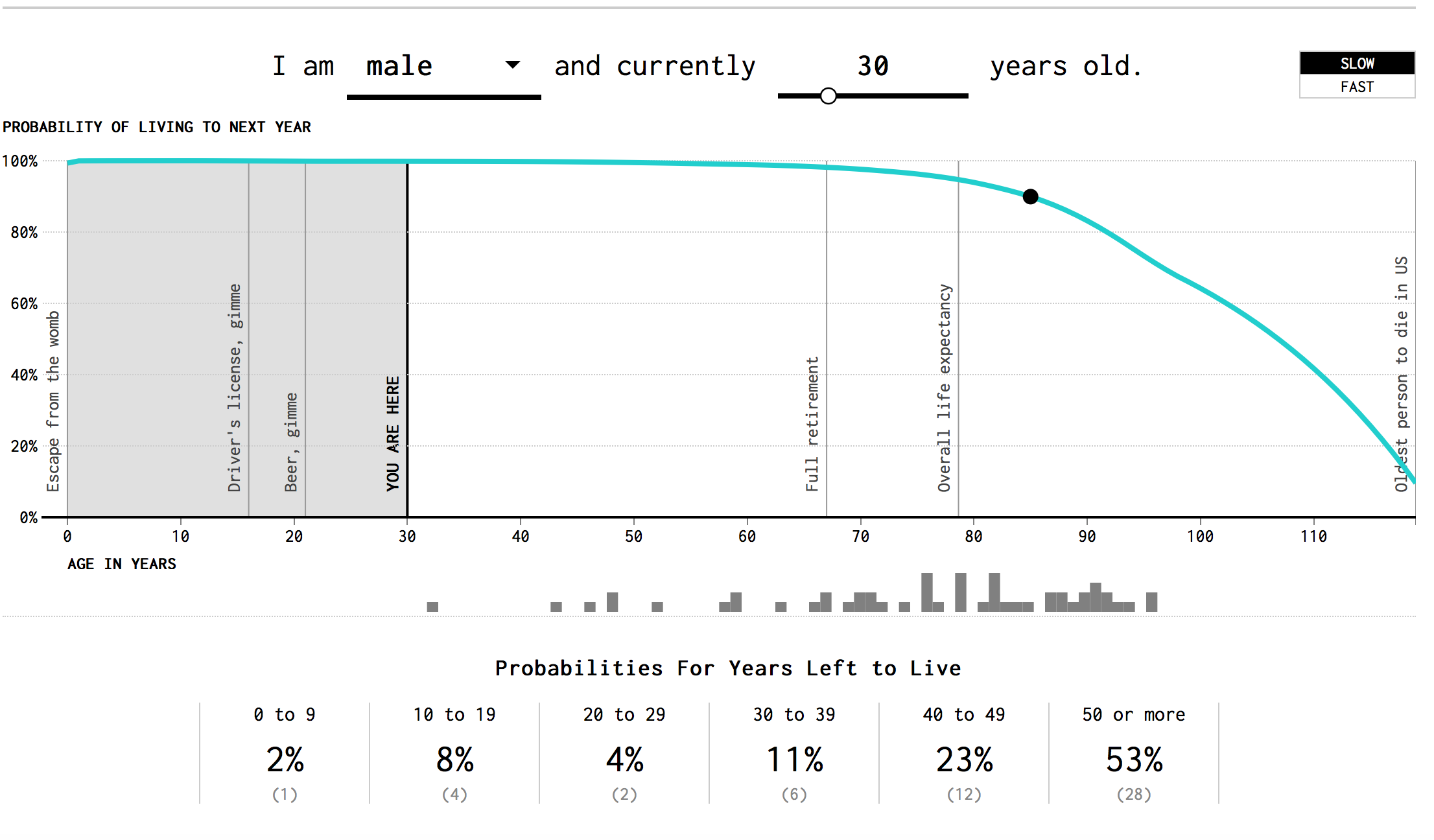
Note that like the actuarial tables, the odds of dying rapidly increase with age!

Every Single Death?

Did you realize the CDC has all 2.6 million or so deaths (per year) recorded in a database?  The data is anonymized!  Just in case you were worried!

  1. CDC Wonder (US deaths): https://wonder.cdc.gov/cmf-ICD10.html
  2. Kaggle (CDC Wonder Extract): https://www.kaggle.com/cdc/mortality/data

I ended up running death statistics by age in a IPython notebook with my currently limited (but improving) understanding of Pandas.  Interestingly enough, I got approximately the same numbers (tallying all death counts).  If you want to do you own analysis, use Kaggle data set.

As someone in their early 30s, I had no sense of aging at all.  Instead, I’m constantly thinking about beautiful places to go on vacation or what to explore in the city (Boston).  Let’s add vacation and Boston photos to cheer the article up:

Image result for Bahamas

Bahamas – Somewhere Beautiful

Image result for Top of the Hub

Top of the Hub!

Anyway, back to the statistics aspect!  What’s another cool factoid we could discuss!

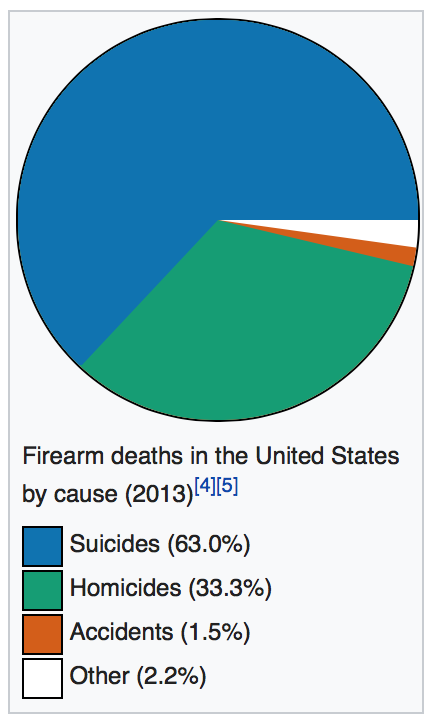
Gun Suicides (note not homicides)

I understand that the buzz in media is to implement gun control to prevent violent homicides.  Did you know that around twice as many people die in gun-related suicide events?  I wasn’t aware of this problem until my sister mentioned it!  Two graphs in Vox really spoke to me:

Link: Vox 17 Charts on America’s unique gun violence problem

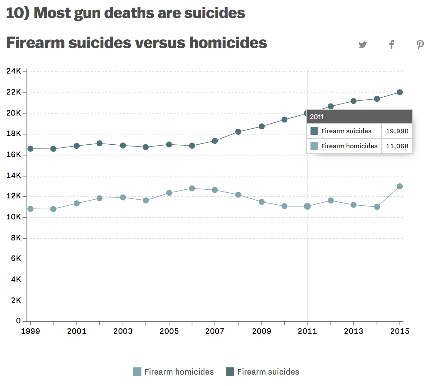
I don’t want to get too deep into gun control (the news covers it well enough), but I do find it interesting that no one in the media talks about what seems to be a huge issue!  Something that claims 2 times the number of lives as gun homicide involving the exact same weapons (guns are involved in 50% of suicides)!

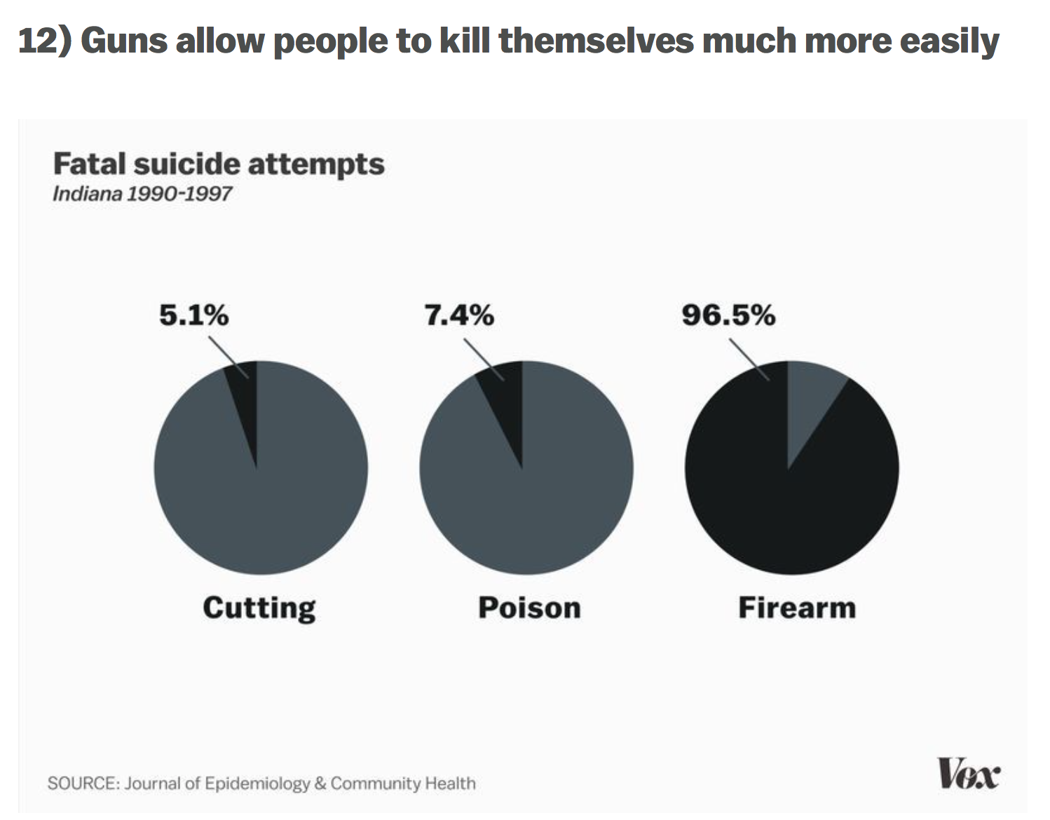
Just to provide a second source, here is a wikipedia chart:


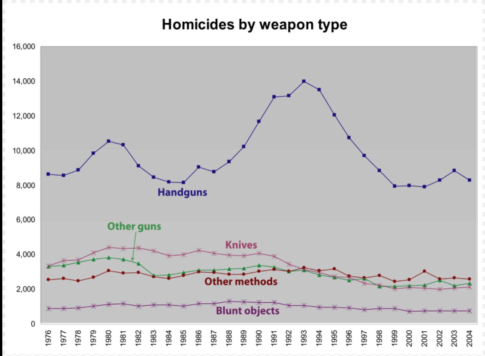
Homicides, what actually happens!

If you read a little more on the wikipedia article, you can find some interesting information.  For example, only 1% of gun homicide involves mass shootings (often shown on televisions) quote from wikipedia:

Deadly mass shootings have resulted in considerable coverage by the media. These shootings have represented 1% of all deaths using gun between 1980 and 2008.[116] Although mass shootings have been covered extensively in the media, mass shootings account for a small fraction of gun-related deaths[17] and the frequency of these events had steadily declined between 1994 and 2007. Between 2007 and 2013, the rate of active shooter incidents per year in the US has increased.

When I think about mass shootings, it usually involves a child who got an AR-15 and decided to vent his anger on the student body.  What does the typical homicide look like?  It happens that 75% of these homicides are caused by handguns.  Shotguns and assault rifles only account for about 9% of gun-based homicides:

According to the FBI, in 2014, there were 8,124 total firearm-related homicides in the US, with 5,562 of those attributed to handguns.[8] The Centers for Disease Control reports that there were 11,078 firearm-related homicides in the U.S. in 2010.[10] The FBI breaks down the gun-related homicides in 2010 by weapon: 6,009 involved a handgun, 358 involved a rifle, and 1,939 involved an unspecified type of firearm.[11] In 2005, 75% of the 10,100 homicides committed using firearms in the U.S. were committed using handguns, compared to 4% with rifles, 5% with shotguns, and the rest with unspecified firearms.[75]

I am not in any way making an opinion about outlawing assault rifles.  Instead, I’m looking at the data and coming to the conclusion that handgun related deaths are much more common (draw any conclusion from that):

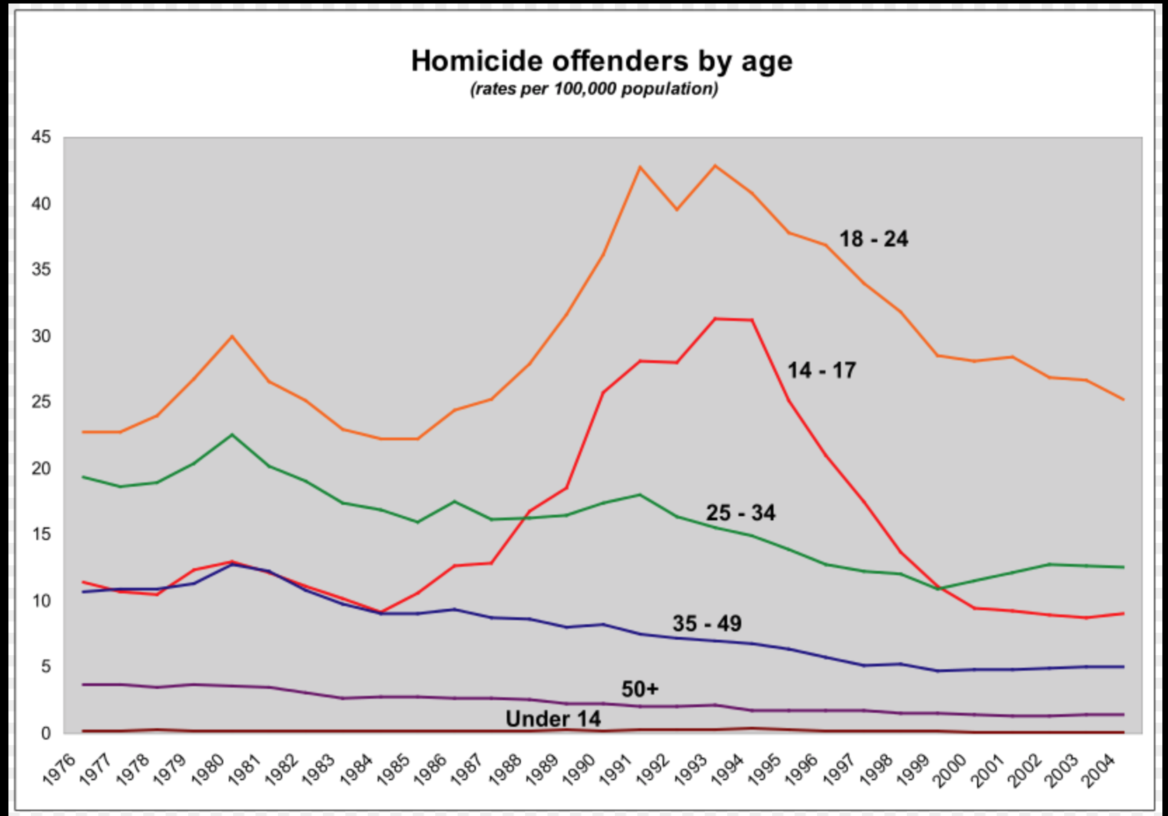
Homicides, the perpetrators!

Another interesting chart on wikipedia is the homicide by offenders age.  The clear outlier here is the age group: 18-24 with 14-17 year olds being more prominent in the 1990s.  25-34 year old range seem to swap places with 14-17 year olds around 2000 becoming the second most violent group!  Alright, we understand the perpetrators, but what about the victims?

Homicides: Victims!

How common is it to die from homicide (all) and let’s bring in suicide as well!  This CDC paper had some really great charts in it:

National Vital Statistics Reports

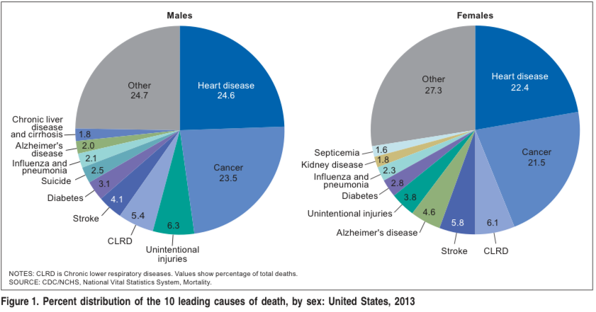
It’s not big enough of a problem to be listed as a top 10 leading cause of death in the US (suicide is a top 10 killer for men: 2.5%).  The more interesting part comes when you break it down by age group:

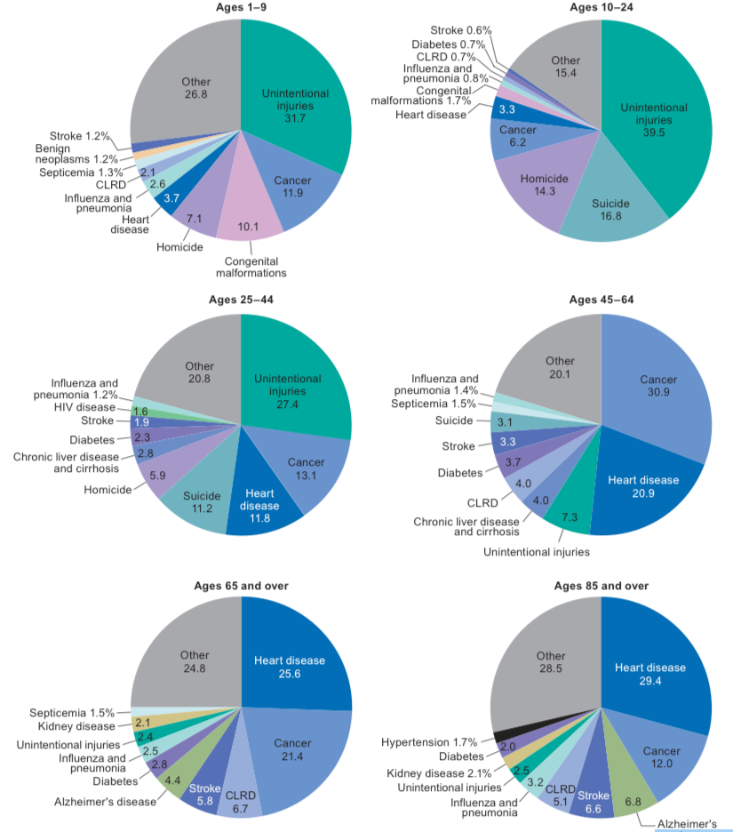
It ends up that suicide and then homicide are responsible for significant percent of deaths between 1-44 and taper off at around age 45 when other diseases become more prevalent.

With such huge percents, you would think that suicide and homicide would be top topics for our society.  The above pie charts misinterprets the amount of deaths.  The odds of dying young are rare!  Only 5% of people die before the age of 45.  That’s less than 200,000 of 2.6 million deaths.  Overall around 10,000 of 2.6 million deaths are associated with gun homicides: .4% of US deaths (all homicides are around .6% of all US deaths).

Gun-related Deaths: The Devil is in the Details!

Data can tell sad stories.  Three of those stories involve: men, old white men and young black men.  An article in fivethirtyeight.com provides the data visualization below (click to interact with it yourself):

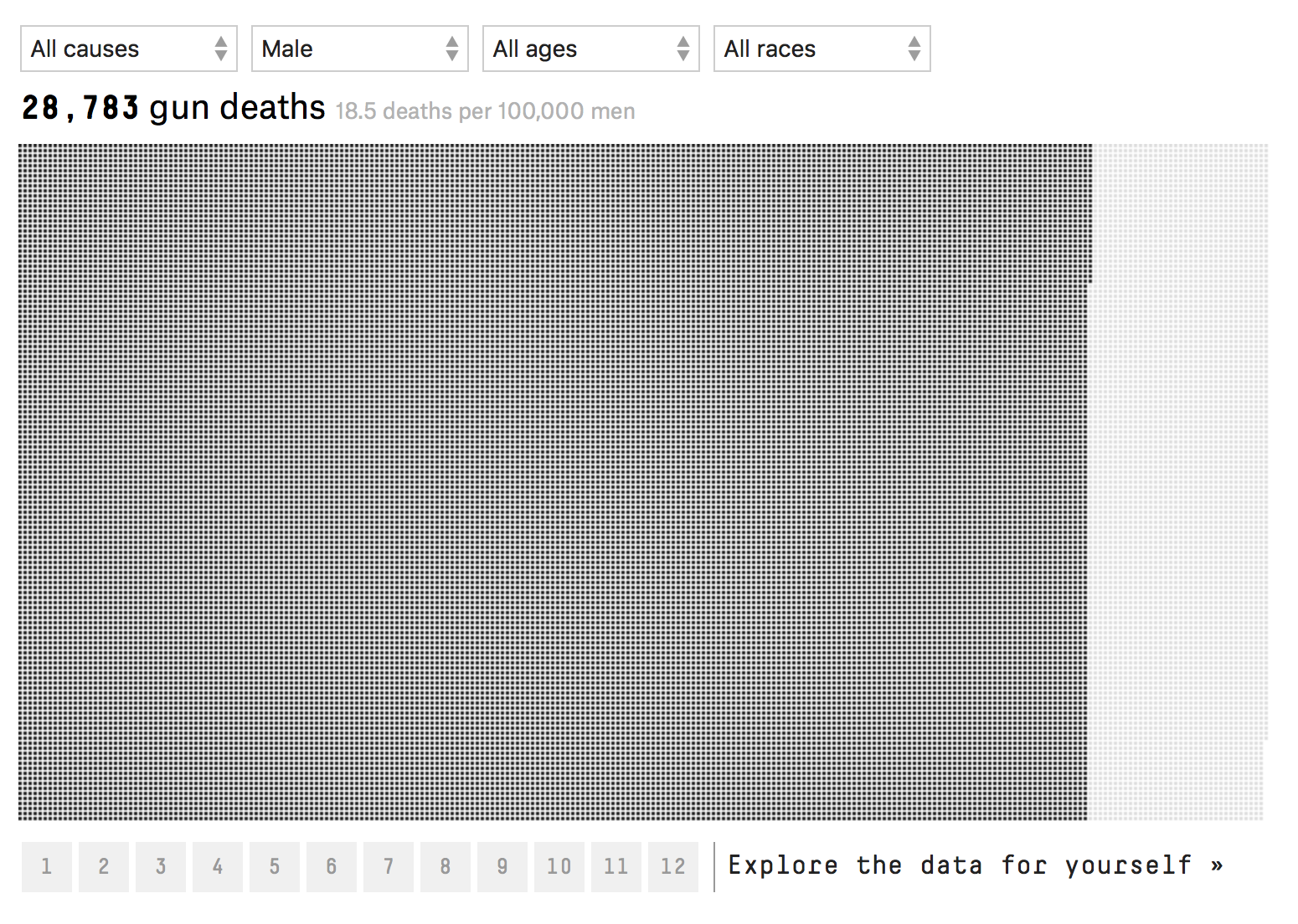
85% of gun-related deaths involve male victims.  Men are 6 times more likely to die from guns than women.  Within the male only group, two groups of victims stand out: old white men and young black men.

If you take all male deaths in the aggregate, 18.5 men die have a gun-related death per 100,000 men.  When you sub-divide this, we find that 11.7 men committed suicide and 6.4 died in homicide per 100,000 men.  The rest of the deaths .4 were related to accidents or could not be determined.  Comparatively, The aggregate statistic for women is 3.0 gun-related deaths per 100,000 women.

Within the suicide statistics, white males are 3-5 times more likely to commit suicide than any other male only racial group.  These odds increase with age.  At ages 15-34, the suicide rate is 13.4 per 100,000 white men.  That jumps to: 19.7 for white men aged 35-65 and a startling 28.2 for white men over 65 years of age.  Black men, the next highest racial group only had 5.3 suicides per 100,000 black men.  A factor of 5 less.

Young black between 15-34 males have the highest incidence of homicide: 73.5 homicides per 100,000.  That’s a factor of 5 higher than 15-34 year old male group: 14.8 homicides per 100,000 and a factor of 10 higher than all males combined: 6.4 homicides per 100,000 men.  Homicides decrease with age.   Black men 35-65 having: 21 homicides per 100,000 and those older than 65 years: 3.4 homicides per 100,000.

Sense of Scale:

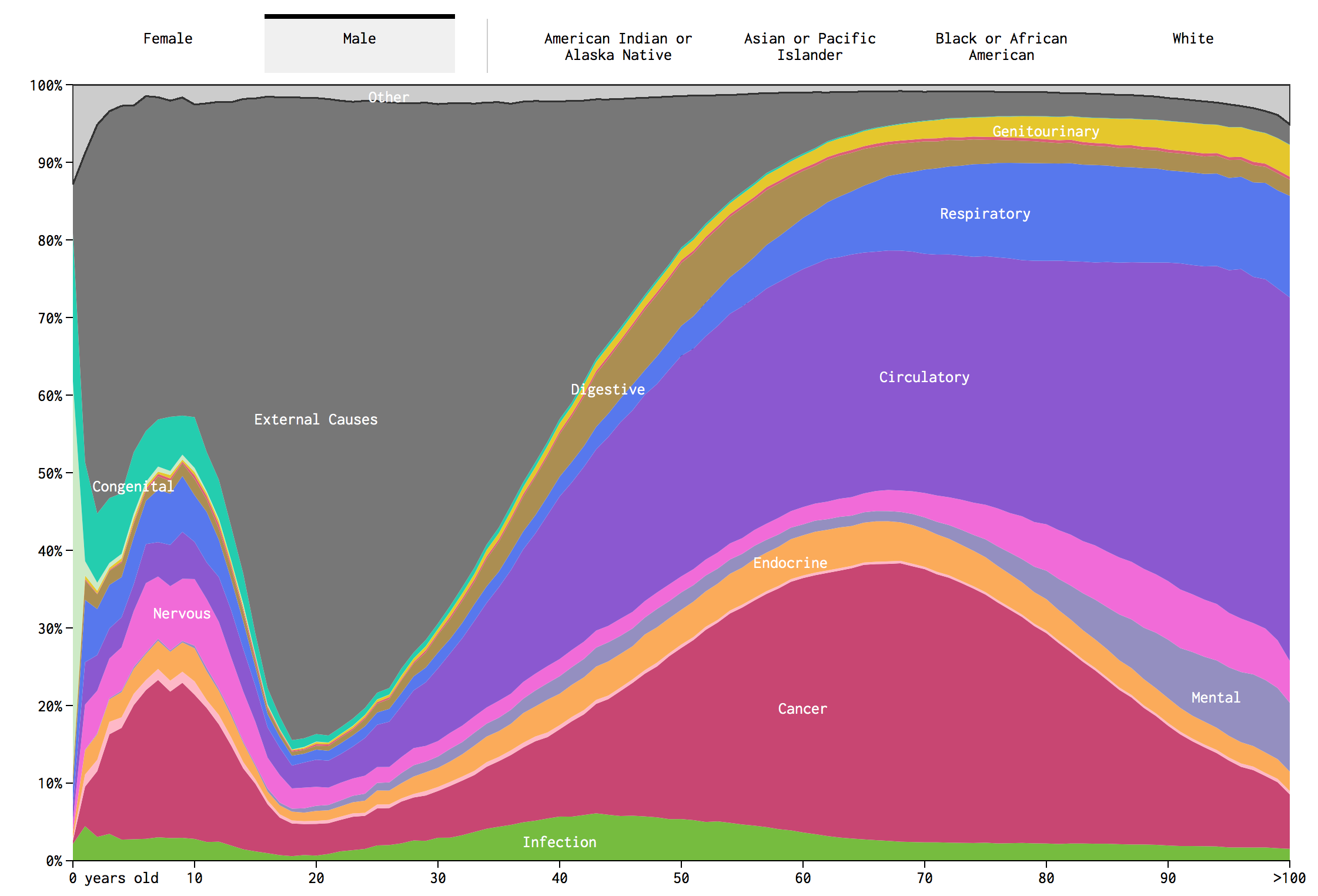
Like most things in life, I often have no sense of scale.    I know for example that around 50% of deaths are caused by Cancer and Heart Attacks.  I have no clue how that varies by age.  The below graphic was really interesting, click to access the interactive variant (provided by flowing data.com):

Scale!

Another cool version of the above data is a simulation done by Flowing Data, click to access the interactive article:

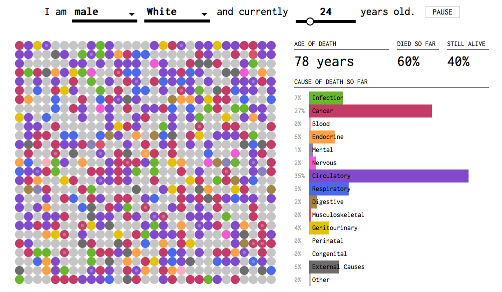
My big conclusion on this is that most deaths are related to age-related/life style disease!  That definitely explains the average life expectancy is in the late 70s and 80s.

Summary:

What is the most important conclusion I got out of this?  Mass shootings with assault rifles is a very rare incident.  That doesn’t make it any less tragic.  On the other hand, homicides with handguns are significantly more common.  Homicides involve a handgun 75% of the time.  The perpetrators and victims are typically under the age of 45 and these deaths represent .4% of all US deaths in a given year.

Only 1 in 20 people die before the age of 45.  The great killers are lifestyle and age-related diseases that become more common after the age of 60.  The amount of deaths increases drastically over time (actuarial tables).  Two diseases: heart attack and cancer account for 50% or around 1.2 to 1.3 million deaths a year.  That’s a staggering number compared to both suicides (around 40,000) and gun-related homicides (around 10,000).  That is, you are 120 times more likely to die of heart attack or cancer than violent gun homicide.

What are your thoughts on the topic?  How do you think scale of the problem should influence public policy?  Do you think we should view mortality rates differently based on age brackets?  How does the media influence on perception of death?  I tried to make this as apolitical as possible so that the data speaks for itself.

Any great data visualizations or research on the topic?

Sources:

Most of the data was derived from the CDC and wikipedia!

Now, for a bit of happiness to improve everyone’s mood (distract from the morbid topic).  Here is a kitten hanging out!

Data Camp: Week Adventure into Python Data Science

Image result for data camp

Introduction:

Noah, a former TechTarget colleague, mentioned  datacamp.com  to me, while we were discussing an issue with remotely hosted files (probably rdp associated) and pandas DataFrames.  On February 10th, I decided to give it a try and today, 6 days later, I finished up the Python Programmer Track (10 classes)!

What is Data Camp?  Data Camp is an online education company that offers data science specific courses.  They focus mostly on two lines of technology: R and Python.  They offer some auxiliary courses in other topics: SQL, Linux and git (as well as a few derivatives).  All the courses are hosted on their online platform, which overall is beautiful to interact with.  A bit more about the topics:

Data Camp Topics:

R – Statistical Programming Language

A statistical programming language inspired by LISP and developed by professors at the University of Auckland.  R has become famous amongst statistics and machine learning researchers where they prototype cutting-edge research and provide it as packages to CRAN, a online index for hosting R code.

Python – General Purpose Language

A general purpose programming language developed by Guido van Rossum.  It’s a dynamically typed, interpreted language that has been used for rapid prototyping and scripting.  Python as a general purpose programming language that can be used for: web development, networking, devops, data analysis and machine learning.  Python has gained popularity over the last few years with increased interest in it’s scientific computing platform.  Pandas, a popular Data Science framework, was inspired by R’s data frame.

SQL – Structured Query Language

Structured Query Language, SQL, is a domain-specific language typically associated with relational database management systems (RDBMS aka SQL databases), but has been coopted by other solutions (BI platforms, Hadoop and Spark).  SQL is easy to learn and revolves around a few common entities: Servers, Databases and Tables (Views etc).  Tables can be viewed as tabular data where rows are entities (employee) and columns are attributes of the entity (salary).  Most SQL is used to retrieve data hosted in tables mediated by RDBMS.

Context

R and Python are used to manipulate data in a procedural way, typically through the use of things like Data Frames (R), Pandas (Python) or Numpy (Python).  These libraries create tabular, matrix, vector or scalar data often rely on vectorized operations to do computation.  Both R and Python have extensive data visualization frameworks to create graphs.  They also have great libraries for statistics, machine learning and artificial intelligence.  SQL is primary associated with data retrieval and is used to get “data” back from a hard drive (through the database).  Most database are more limited in functionality when it concerns more finite data manipulation, graphing and machine learning (though extensions do exist).  They make up for it by being able to store large quantities of data without relying extensively on memory (volatile and limited).  Generally, most software engineers and analysts use both a programming language like (R/Python) and SQL (to access data).

Data Camp:

Summary:

Data Camp breaks down Python/R courses on career tracks: Python Programmer, Data Analyst and Data Scientist.  Each track is composed of a number of courses: 10, 13 and 20 respectively.  Topics covered: basic programming, data manipulation techniques, graphing, statistics, machine learning, network analysis and ai (1 course).

Each course is composed of 3-5 segments.  Each segment has a set of lectures followed by exercises.  You can expect around 3 lectures and 10 exercises per segment.  Most courses build on themselves intuitively beginning with the basics and gradually building up in complexity.  I was surprised to find lectures on generators, closures and how they relate to data frames within the first 4 classes.

Lectures:

datacamp lecture

Lecture portion of the website is beautiful.  Presentations have nice transitions and the website background is not distracting.  Lecturers were clear and easy to follow.  You get a sense that al to of effort was put into the curriculum.  There were multiple lecturers in the 10 courses I took (around 5-6).  Some of these lecturers work for esteemed companies like Anaconda, published books on the topic they spoke on or had a background in software engineering/consulting.  Overall, the lectures were high quality with very few mistakes.

Practice Sets:

datacamp practice problems.

The practice problems were conducted in what looks like a modified ipython notebook embedded in the website.  They have 4 panels, the 2 on the left: exercise and instructions and 2 on the right: Scrapt.py and ipython Shell.

The exercise and instructions provide guidance on how to complete the exercise.  The Exercise section explains the topic.  The instructions tell you what steps need to be completed before submission is excepted.

Script.py is where you write your code.  The run code button let’s you execute script.py and see the output in the IPYTHON SHELL.  It’s pretty interactive.  When you submit answer, it checks if the solution matches the instruction section.  For the most part, there are few cases where code I submitted was marked wrong when it was in fact right.  That’s great!

What if you get stuck on a programming problem?  There is a button called hint.  This provides some extra guidance typically in the form of small chunks of code.  If you press the hint button, a new button called show solution will appear.  Clicking the show solution button will overwrite the SCRIPT.PY window with the correct solution, which you can then run and submit.

In rare occasions, you might end up with a multiple choice question.  They offer an interactive shell in this case.  It always proceeds the more free-form question variant.

Gamification:

Data Camp has one really great feature that I liked.  Each exercise has an amount of xp that you can collect.  Each lecture is worth 50xp, multiple choice is worth 50xp and problem sets are worth 100xp.  If you click the show hint button, the problem set xp is reduced to 70xp.  Show solution gives you 0xp.  When logging in, you will see the total xp you got that day as well as how many days in a row you have utilized data camp (streak). This is a great way to motivate you to do the exercises.

Another layer of gamification comes from certificates you can collect (and post on linkedin) as well as career tracks you can complete.

Cost/Summary:

I think data camp is very friendly to beginners interested in learning about data analysis in Python and R, both marketable skills.  I think the course layouts, lectures and practice problems are well thought out.  I would suggest that beginners also read books and online documentation on subjects like Pandas and Numpy.  I found data camp focused more on practicing skills and less on implementation details (which is a good thing).

Data Camp is currently on sale for $180/year (usually $300/year).  You can also buy it as a monthly subscription for $30/month.  Data Camp is similar to Udemy.  There are 3 advantages Data Camp has over Udemy:

  1. Practice problems make up a larger percent of the curriculum.
  2. $30/month you have access to any one of 100+ courses.  The Udemy equivalent is $15/course.  A Udemy course is equivalent to 3 Data Camp courses (in material)
  3. Data Camp specializes in data science and has really thought about how to naturally progress through the data science material.
  4. If you like structured programs, this is better.

Advantages of Udemy:

  1. Overall larger selection of content, variety and topics.  If you want to practice Python, but want to tackle multiple topics like: web programming, networking, penetration testing or a specific subset of machine learning.  It might be a better option.
  2. There is no subscription fee.  It’s fixed cost.  If you are not sure you want to invest a lot of time into python programming this is a better choice.
  3. Lectures are not as uniform.  You might find some lectures that are more theoretical.  Others are more practical.  That means you can try out different lecture styles to see what works.

Best,

Chris


Monitor: Graphite, Collectd, Statsd and Graphana

Dear Reader,

Need to monitor many computers at the same time? Are you worried about a pegged CPU, memory paging, lots of swap space activity or low disk space? What about high network traffic? These things are readily available on Amazon through AWS CloudWatch.

I decided to implement 1 of 2 major monitoring stacks. The first stack is: Logstash, Elasticsearch and Kibana (ELK stack). The second group of technologies is: Collectd/Statsd, Carbon/Whisper and Graphite/Graphana.  I implemented the later.

My pre-mature conclusion is:

  1. ELK stack: Is great for text heavy documents.  Elastic Search is based on Lucene, a popular open-source search engine.
  2. Graphana/Carbon: is great for time series analysis with an emphasis on near realtime data feeds.  Collectd provides a convenient plugin/interface to operating system statistics.

Below is the Front-end component monitoring the monitoring computer (not WordPress):

Graphana Server

Graphana Server


The components of the system are:

  1. Collectd – data collection software with a plugin architecture.  Common plugins seen above include: CPU, Memory, Disk Usage, Processes, Network Traffic, Apache metrics and much more.
  2. Statsd – Used more for application monitoring.  You can send custom metrics based on set intervals.  The common 4 metrics I saw: gauges, counts, sets and intervals.  The first one takes the last of measurement within an interval and reports it.  Counts aggregate data over 10 seconds.  Sets return a unique count of values encountered (via UDP).  Intervals are time-based calculations (like rates).
  3. Carbon/Whisper – A data store focused on time series aggregation.  Data is aggregated based on two configuration files.  The first sets up regex matches (used to categorize TCP traffic) followed by a data retention policies as well as specifying polling time-frames (typically in seconds or minutes).  The second file specifies the type of aggregations available: sum, min, and max.
  4. Graphite/Graphana – Graphite is a front-end dashboard tool for carbon.   Graphana serves a similar role, but with a sleek black UI (featured above).  Both are similar to Kibana.  They both provided dashboard and graphing utilities to their respective data stores.  With Graphana being able to access other sources (like ElasticSearch).

For my Graphana localhost dashboard, I used CPU, Memory, DF and Processes modules from Collectd.

If interested in trying out the service, I can recommend the following 4 articles (Ubuntu):

digital ocean: metric tracking tutorial

For Graphana, you have to follow these instructions:

Graphana Install

Best,

Chris


Interactive Programming Diagrams

Python Tutors

Introduction:

Philip J. Guo is a professor of Cognitive Science at UC San Diego, who focuses on teaching programming at interactively online.  He has produced great products for both programming beginners and those interested in Python internals (10-hour lecture).

He impressed me with Python Tutors website: python tutors. Python Tutors is: Python, Java, JavaScript, TypeScript, Ruby, C and C++.  Python tutors converts Python written on the left into data structures on the right.  This provides a deeper view of what Python is actually doing.  The diagrams are step-based, which means you can see the execution of each line of code and what happens beneath the covers.  Red and Green arrows show you the line to be executed and the line being executed.  An example below.

Example (click image to go to interactive page):


Related Posts:

introduction to python – health innovators class

great python books – beginner to intermediate

Happy Holidays,

Chris

Statistics and Machine Learning Visualizations

Visually Explained

At work, a software engineer provided a link to interactive data visualizations.  The visualization shows a statistical model and their fit with data.  The data points can be moved/modified instantly influencing the model.  It’s a fun way of seeing how a model works.

Interactive Data Visualizations: Statistics Models

Example Interactive VisualizationExample Interactive Visualization

The models and concepts available are: PCA, OLS, Conditional probability, Markov Chains, Eigenvectors and Image Kernels.

Chris

Similar Posts:

Machine Learning: Part 1